The banner ad on Naver's (Korea's largest search engine) mobile search home, also called Smart Channel, changes on December 2, 2026. The 750×280 image banner you have been using can no longer be newly registered or edited, and its place is taken by the native image banner type (mobile search home), where you upload an image and copy separately and Naver combines them to fit the placement. The basic ingredients are a 450×450 cut-out image with the background removed and a few short lines of copy, so the workflow of producing a single finished banner file changes from the start.
"For next month's promotion banner, we can just make the usual 750×280, right?" If you get this question while writing a design brief, this time you should pause for a moment. In this post, I'll walk through what is changing, how to prepare images and copy for the new format, and the parts that are easy to get wrong during the switch.
1. What changes in Naver banner ads from December 2?
According to the Naver display ad notice (posted November 2, 2026), two changes happen at the same time.
- Effective date: December 2, 2026 (Wednesday). The notice says the schedule may change due to internal circumstances.
- What stops: new registration and editing of image banner (750×280) creatives
- What starts: new registration of native image > banner type (mobile search home) creatives
- Why: to improve ad quality and strengthen dark mode support
750×280 creatives you have already registered keep serving after new registration stops until a separate announcement, and management functions such as viewing the list, turning them ON/OFF and deleting them remain available. However, the notice also states that existing creatives are scheduled to stop serving in stages, so preparing the new format in advance makes more sense than holding on to the old banners.
| Item | Image banner (750×280) | Native image banner type (mobile search home) |
|---|---|---|
| What you upload | One finished banner image | Cut-out image + main and sub copy, separately |
| Image specs | 750×280 | 450×450, PNG, up to 500KB, transparent background |
| Layout | Shown exactly as made | Auto-generated in two forms, image on the left or right |
| Dark mode | No separate guidance in the notice | Copy color applied automatically for light or dark mode |
| After December 2 | New registration and edits stop; existing creatives to end in stages | New registration starts |
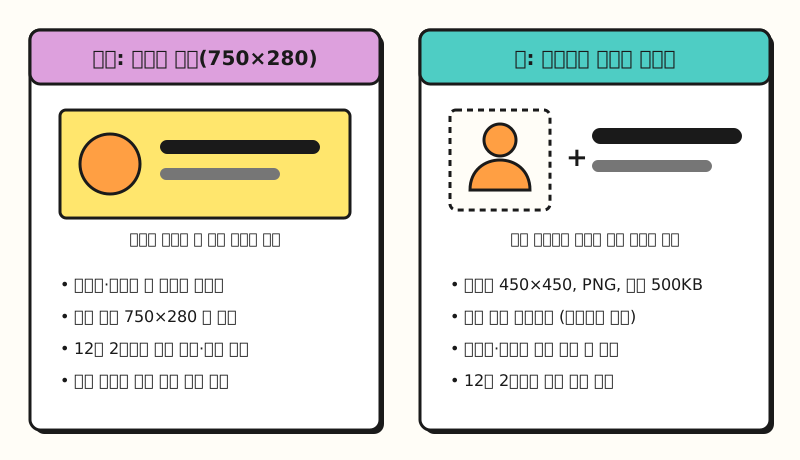 Example figure: the specs from the notice and creative guide shown as comparison cards, not an actual ad screen (figure labels in Korean)
As an analogy, until now you framed a finished poster and hung it, whereas from now on you hand over the product photo and the copy separately and the store arranges them to match the lighting and wall color. So what exactly should the "ingredients" you hand over look like?
2. How should you make the native banner image?
The mobile search home ad creative guide (updated October 21, 2026, PDF) linked in the notice shows that the image is a single cut-out object image. A cut-out (called "nukki" in Korean) is an image with the background removed so only the subject remains, and the notice clearly states that the banner type accepts only cut-out images and does not support thumbnail-type images that include a background.
There are two ways to make the cut-out image.
- "Create image" in the advertiser center (creative builder): it handles background removal for the object and logo, combining and placing the two, and an OutGlow (a glow effect that lights up the edges) for dark mode in one go. The source image must be at least 390×390 with at least 10px of margin at the top, left and right, and to add a logo you upload a separate 1:1 logo image of 300×300 or larger.
- Making it yourself: use this when the builder doesn't give you the cut-out quality or logo position you want. On a 450×450 canvas, leave 30px empty on all four sides, and place the logo inside the safe area (390×354) that avoids the bottom 66px.
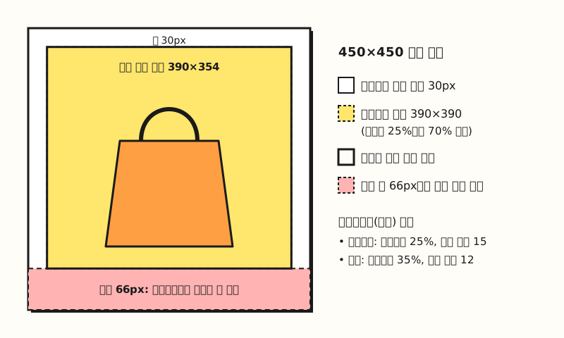 Example figure: a simplified diagram of the creative guide's self-made specs (figure labels in Korean)
The reason to watch the bottom 66px is the gradient newly added at the bottom of the ad area in the Naver app, which the guide says is displayed so that it naturally covers part of the bottom of the object. If you stick the logo at the very bottom, the brand name itself may end up faded.
There are a few more values to follow when making it yourself.
- OutGlow is required: for the object, white (#FFFFFF) at 25% opacity with blur up to 15; for the logo, white at 35% opacity with blur up to 12 (based on Adobe graphics tools). Too much blur makes the glow look cut off at the 450×450 boundary.
- Object size: use between 25% and 70% of the 390×390 area left after the margins.
- Retail industry: the seller's (retail advertiser's) logo or full business name must be included in the creative, and the logo area must be at least 1,000px.
3. How many characters can the copy have?
Copy length trips people up as often as the image does. The copy guide by type in the creative guide sets the following maximums, spaces included.
| Type | Composition | Max characters (spaces included) |
|---|---|---|
| 1-line | Main | Main 12 |
| 2-line | Main + sub | Main 12, sub 15 |
| 3-line (film) | Main + sub + rating and release date | Rating and release date 22 |
| 3-line (disclosure) | Main + sub + 1-line disclosure | Disclosure 26 |
| 2-line review number | Main (+sub) + 2-line disclosure and review number | 45 total including line break |
| Call-to-action button | Main + sub + button (CTA) | Disclosure and review number not allowed |
Choose the type based on what the ad says. A message that fits in one line, like a discount rate or a period, is fine with the 2-line type, while for something like an insurance ad that must show a review approval number, you need a type that includes the disclosure and review number. The call-to-action type fits when you want app installs or participation right away, but according to the guide, participation campaigns must use the button, so you can't add disclosure text with it.
Twelve characters for the main line is shorter than it sounds, so if you receive several copy candidates, it helps to filter them in a sheet first. Put the main copy in column A and the sub copy in column B, then enter the formulas below in columns C and D.
C2: =IF(LEN(A2)<=12,"OK","Main over by "&LEN(A2)-12)
D2: =IF(LEN(B2)<=15,"OK","Sub over by "&LEN(B2)-15)
The LEN function counts spaces as characters, which matches the guide's "spaces included" rule. That said, the guide adds that typeface and the maximum number of characters may look slightly different depending on the default font settings of the user's device, so it's safer to use the sheet check only as a first filter and do the final check in preview.
There are also limits on what the copy says. The guide says you can't use contact details such as phone numbers, emails or addresses, expressions that name and compare against another company or product, or special characters repeated without meaning, and since shorter copy makes you want to add emphasis with "!!!" or "★", this is a part to be especially careful with.
4. What should you watch for with automatic left and right layouts?
The most unfamiliar part of the new format is that the advertiser doesn't choose the layout. A registered creative is auto-generated in two forms, one with the image on the left and one with it on the right, and either one is shown at random. The notice says the layout will later be fixed to one based on performance, but until then you have to make the creative with both forms in mind.
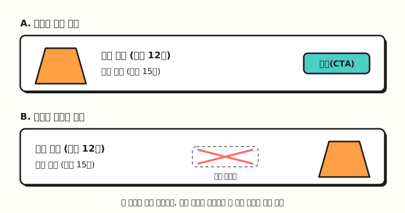 Example figure: a simplified wireframe of the two layouts described in the notice, not an actual screen capture (figure labels in Korean)
This creates three things to watch.
- Images with a direction: an image with direction, like a model looking right or an arrow pointing one way, can look awkward when placed on the opposite side. The notice also recommends checking that it looks natural on both sides before registering.
- When the button disappears: if the image is placed on the right, the call-to-action button isn't shown even if you registered one. Rather than leaving the key action (such as "Download app") to the button text alone, write the main and sub copy so the message works on its own.
- The chevron icon that's added automatically: when the copy is short and leaves a lot of empty space, the system automatically adds a chevron-style landing icon at the right end. It helps to know that seeing an icon you didn't register in preview is not an error.
Some image types are also easily rejected. The guide restricts images with borders or padding, images split into several pictures, low-resolution images, images that could mislead about efficacy such as before-and-after cosmetics comparisons, and images that may cause disgust. As conditions for photos that cut out easily, it lists clear outlines, good separation between subject and background, sharp focus, and no strong backlight or heavy shadows, so it's worth using these criteria from the moment you pick your shots.
5. If you've been running the old banner, in what order should you switch?
Let's assume you run a seasonal sale banner on the mobile search home for an online store, and follow the switch from start to finish.
- Don't delete existing creatives: 750×280 creatives keep serving until a separate announcement, but according to the notice, deleted creatives can't be registered again. Even for creatives you no longer use, turning them OFF rather than deleting them makes it easier to go back.
- Gather image materials: from your main product photos, pick shots with clear outlines that stand out well from the background, and prepare the brand logo at 300×300 or larger in 1:1. In retail, the seller's logo or full business name must be included.
- Try the builder first: after December 2, try the cut-out and OutGlow in the advertiser center's "Create image", and if the quality falls short, give your designer the self-made specs (30px margins, bottom 66px, OutGlow values).
- Filter the copy: use the sheet formulas above to remove candidates over 12 characters for the main line and 15 for the sub line, then read them to check they make sense without the button.
- Preview on device: according to the performance display ad preview help page, running "Preview on device" from the creative info panel in the ad creative dashboard or the preview panel on the creative edit screen lets you see a test ad in the actual placement with your registered Naver ID. The test ad can be checked within 1 hour after running it and doesn't appear again once shown, so to compare light and dark modes, simply run it again. The help page also notes that some paths may not be listed or several placements may be grouped together in the path list, so whether the mobile search home path appears separately needs to be checked after you register the creative.
If impressions are lower than expected after switching to the new creative, before blaming the creative alone, follow the order in the display ad impressions check help page and check whether the creative's review status is "on hold", whether the budget and bid are adequate, and whether you've narrowed targeting too much.
※ Note: registration may be restricted depending on your industry
The notice lists separate industry restrictions for the banner type (mobile search home).
- Restricted industries: hospitals, clinics and medical institutions; pharmaceuticals and medical devices; health information and services; marriage information and matchmaking; tobacco; adult
- Restricted on review: underwear and swimwear; diet, hair loss, wigs and personal hygiene products; adults-only and horror films; funeral services; contraceptives (including oral contraceptives); adult content (other than films)
There is also a slightly confusing point. The display ad industry guideline relaxation notice (October 29, 2026), posted four days earlier, said guidelines would be relaxed so that hospitals and clinics, pharmaceuticals and medical devices, and funeral services can run ads on the search home Smart Channel (Special DA), with hospitals and pharmaceuticals and medical devices to apply sometime in November 2026. On the other hand, the November 2 banner type notice lists the same industries as restricted or restricted on review, so how the two notices apply together to the new banner type isn't clear yet. If you run ads in these industries, check for further notices around December 2 and ask once more through the Naver ad AI chatbot mentioned in the notice or your sales representative.
Wrapping up
With this change, Naver mobile search home banner ads move from a single finished banner to uploading ingredients: a cut-out image and short copy, and Naver handles the layout and dark mode colors. Keep your existing 750×280 creatives instead of deleting them, and preparing image materials and copy candidates before December 2 will make the switch much easier. I plan to update my own banner design brief to the new specs too, so for detailed values, please refer to the mobile search home ad creative guide.
FAQ
- Will my existing 750×280 banner ads keep running after December 2?
- According to Naver's notice, 750×280 image banners already registered keep serving until a separate announcement even after new registration stops, and you can still view them, turn them ON/OFF and delete them. However, they are scheduled to stop serving in stages and deleted creatives can't be registered again, so it's better to prepare new banner type creatives in advance.
- What are the image specs for the native banner type?
- 450×450 PNG, up to 500KB, and only cut-out images with the background removed are accepted. Thumbnail-type images with a background aren't supported. If you make it yourself, follow the creative guide: leave 30px margins on all four sides and apply the OutGlow effect for dark mode.
- How many characters can digital banner ad copy have?
- For Naver's mobile search home banner type, the main copy is up to 12 characters and the sub copy up to 15, spaces included. A 1-line disclosure can be 26 characters, and a 2-line review number can be up to 45 characters in total including the line break. The number of characters shown may differ slightly depending on device font settings.
- Why doesn't the call-to-action button I added show in the ad?
- The native banner type is auto-generated in two forms with the image on the left or right and shown at random, and when the image is on the right, the button isn't shown even if you registered one. It's best to write the main and sub copy so the message works without the button.
Related posts
These posts help with understanding how banner ads work and how to read their performance.
- Display Ads Explained: How Banner Ads Seem to Read Your Mind - how banner ads work through targeting and retargeting
- CPC, CPM, CTR, ROAS: How to Calculate Core Ad Metrics - the metrics to compare after you change banner creatives
- Landing Page Optimization: Google Ads Landing Page Experience - how to check the page people land on after clicking a banner